skip to main |
skip to sidebar
This week's color combo for Kristin's Summer of Color, voted in by participants, is sepia and sage green. Here are my last two ATC's for this fun summer project:
y summer is going by so quickly and I have been busy with my church activities, my family and my yard work/flower garden. Not much time to do artsy stuff, because I would rather be out and about! However, I did get a couple of journal spreads done in my little moleskine. Here is the first:
A quote by Emily Dickinson. I used rubber stamps, a Hero Arts stencil and distress inks on this spread.
And here is the second:
More stamps, stencils, die cuts and Stickles glitter.
Hope you are enjoying your summer, too!
Just a quick post today for Kristin's Summer of Color. This week's colors (chosen by popular vote) are red and yellow. I rarely use these two colors together, but had a bit of fun coming up with two more ATC's to add to my collection:
Stamps are from Magenta. I think of these colors as a bit Asian so that is what inspired these ATC's.
Thanks for all of your sweet comments and, also for your inspiration during these colorful weeks!!
It is hard to believe that this is the fourth week of Kristin's Summer of Color. The colors that were voted in for this week are charcoal gray and pale pink. I do not think of these colors for summer, but maybe that's isn't the intent of this challenge. Perhaps it is just a way of getting us to think of using colors that we may not normally use.
Again, I chose to make two ATC's for this week. I will enjoy looking back at my collection of ATC's using the six different color combos.
Kinda' girly and romantic this time. I found both of these images in an old Readers Digest song book. The word phrases were cut from old books; something I do when I am watching TV and there are too many commercials! I like to use them in ways that make sense or not; whatever strikes my fancy.
Have a great week!
for the local monthly swap with my friends. Here is a page I did for Renee, whose theme is Paris, or anything French related.
This page was pretty much a LOVE page and I like the way it turned out. The doily was made with a Martha Stewart punch that allows you to make different sizes of doilies, the smallest being 6 inches wide and the largest being 12 inches wide. LOVE it!
And here is a page I did for Maureen, whose theme is Halloween:
She also collects owls, so I thought this page was very appropriate for her and a bit spooky, too.
Just a reminder that Google reader is shutting down as of Monday. If you are still interested in following my blog(s), you can do so at Bloglovin'. Check it out.
Thanks for visiting and have a great weekend!!
I didn't think I would be able to come up with anything for this week's colors at Summer of Color number three hosted by Kristin. But, I did make two ATC's that are pretty cool:
Dylusions spray inks and Ranger distress inks were used for creating the background. I masked off some loose stripes and sprayed over the tape. The inks did seep under the tape, but that made it more interesting. I used the cap from the Dylusions bottle to make some marks on the one and a stamp to make splotches on the other. The image on the right is from B Line Stamps. German foil scrap is from Artchix Studio.
Thanks for visiting. I'm off to check out some of the other creations.
The colors for this week at SOC are orange and hot pink. I do like these colors together. I am going to be busy the rest of this week and may not have time to post again, so decided to post today. I used these colors for three different projects, the first being this ATC:
The background was made with a Hero Arts, stencil and background stamp and a Impression Obsession cover-a-card stamp. The large heart is a Sizzix die and the medium heart is one that I hand-carved. The small heart is a punch from EK Success.
Then, I made this card:
A new circle stamp from Hero Arts was used for the background and for the rest of the card. As you can tell, I do have a lot of Hero Arts stamps!!
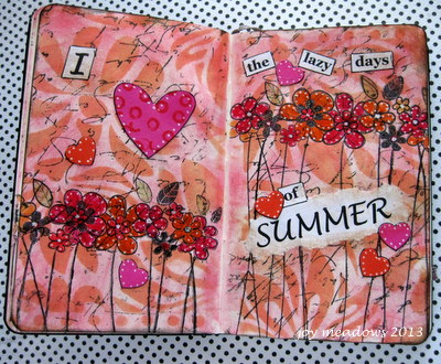
And then I did an art journal page in my new Moleskine journal:
This spread turned out a bit murky to me. In hindsight, I would have omitted the script overstamping or, at least, used a lighter ink color for it. Friday will be the first day of summer and, I am looking forward to lots of lazy days!!! Summer goes by way too fast in my opinion.
I am also linking this post to the Glue It Tuesday Week #14 challenge.
Hope your day is a great one!
Last week, members of the Summer of Color, sponsored by Kristin, the owner of the Twinkle, Twinkle blog, were asked to vote for their choice of a color combination to use for this week's art projects. The colors chosen were citron green and turquoise.
First, I created my background by combining Dylusions lime green spray ink with some squeezed lemon distress ink on a craft sheet. I pulled white cardstock pieces through the inks and let it dry. Then I added some Dylusions turquoise spray to the sheet and added that to the previous colors. I repeated this process until I was happy with the results. Some random stamping with a Magenta dandelion was done with salty ocean distress ink.
Here is the first ATC I made, which I will enter into the Simon Says Stamp and Show challenge, since I do have one tiny button on the butterfly.
The die cut butterfly was sprayed with Dylusions blue ink. I let it dry and then used a polka dot stamp dipped in water to "bleach" some spots on the butterfly. Turquoise Stickles were added to the dots.
My next ATC was created in much the same way, using ArtChix Studio clipart, a sentiment and some dew drops.
I do love to use touches of black on most anything I make because I like the contrast.
Lastly, I made this tag:
A stencil, white gel pen, die cut flowers, Tim Holtz and Wendy Vecchi stamps, glitter and seam binding dyed with distress inks were used for this tag.
Have a wonderful day!